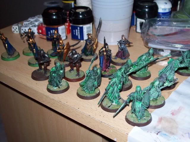
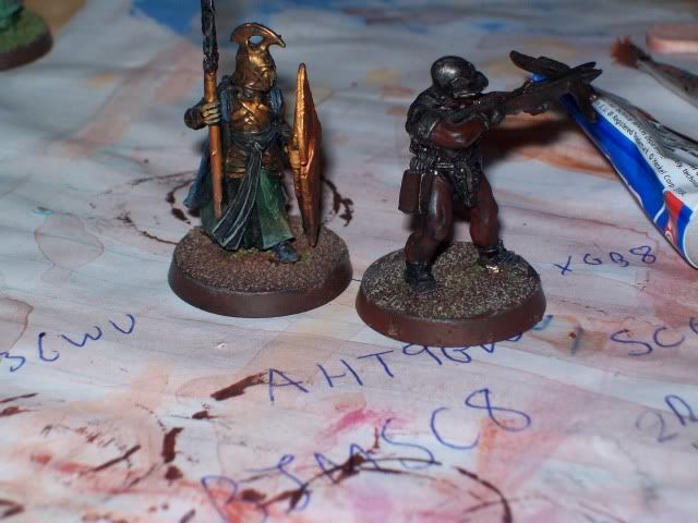
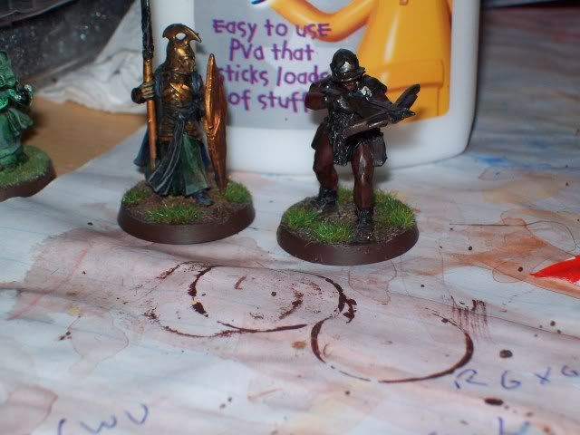
Looking good, extra kudos for having the bottle to tackle doing the eyes but I have a couple of suggestions.
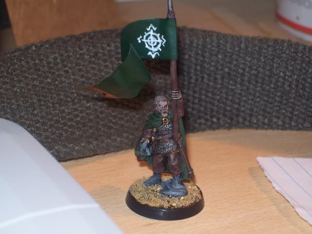
The skin is still too dark. Perhaps use Dwarf Flesh to brighten it up a little, even if you need to wash it with Ogryn Flesh afterwards. I ended up doing this with my Dunlendings/Wildmen, as the Devlan Mud was far too dark.
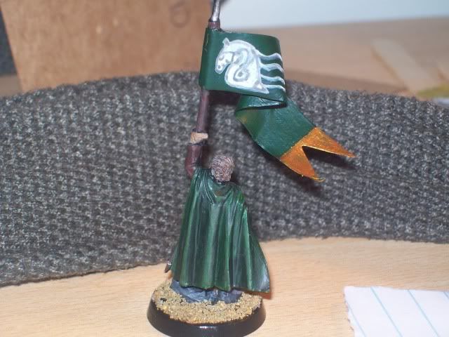
The gold on the end of the flag needs at least one more coat, as the green is still showing through (unless it is a reflection).
Diversity! The trousers, sleeves, belts, scabbard and banner pole all seem to be exactly the same colour. Either lighten some of them, or use washes to darken some to add slightly more contrast to the mini, otherwise you will run the risk of it looking like a green and brown blob from a distance. The same goes for the cloak/Orc head and the boots/rock. I know I've championed using a tight palette on numerous occasions, but you need to add some variety. As an aside, any chance of a pic focused on the Orc head?
The freehand on the banner... I don't know why, but the Horse head, whilst it still needs some work, has a definite likeable quality. I'm quite taken by it. The symbol on the otherside, not so much. The lines are noticeably different widths, so, you would probably have to tidy the edges with green to thin them down and get it looking symmetrical, and the symbol is badly aligned as it sits closer to the bottom of the banner than the top. For future reference, either sketch out your banner design on some scrap paper until you are happy with it, or very lightly draw it onto the model with a pencil. That way, you can fiddle about with it until you get it right, rather than adding loads of layers tidying it up. If you feel that your brush skills aren't quite up to the task, varnish the model then use an artists pen to draw in the design (normally in black), then varnish again to seal it. The beauty of this is that any mistakes can be easily wiped off with a damp cottonbud.

 Top
Top Top
Top Top
Top Top
Top Top
Top Top
Top Top
Top Top
Top Top
Top Top
Top Top
Top Top
Top Top
Top Top
Top Top
Top Top
Top Top
Top Top
Top Top
Top Top
Top


