It was super hard to choose.
Sithious - Keep working on it.
Aule the Valar - awesome work on Gorbag and Shagrat. The colors are perfect for them. The eye on the chest was a sharp idea too.
Ar-pharazon - Dude those are fantastic. Great conversions, very original work.
Joshuar-au - perfect execution of the standard colors. I love that scheme and used it on mine too. You make me want to take a look at them again and see if I can tighten anything up. Great job.
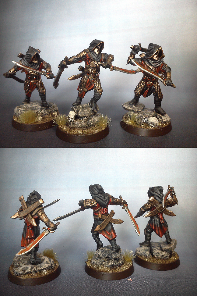
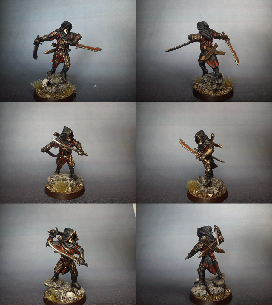
Halauas - No joke, I seriously want to buy more guys and copy that idea. Those look awesome. Paint Jobs are fantastic and you try some interesting color blends on the cloak and uniforms. Super work.
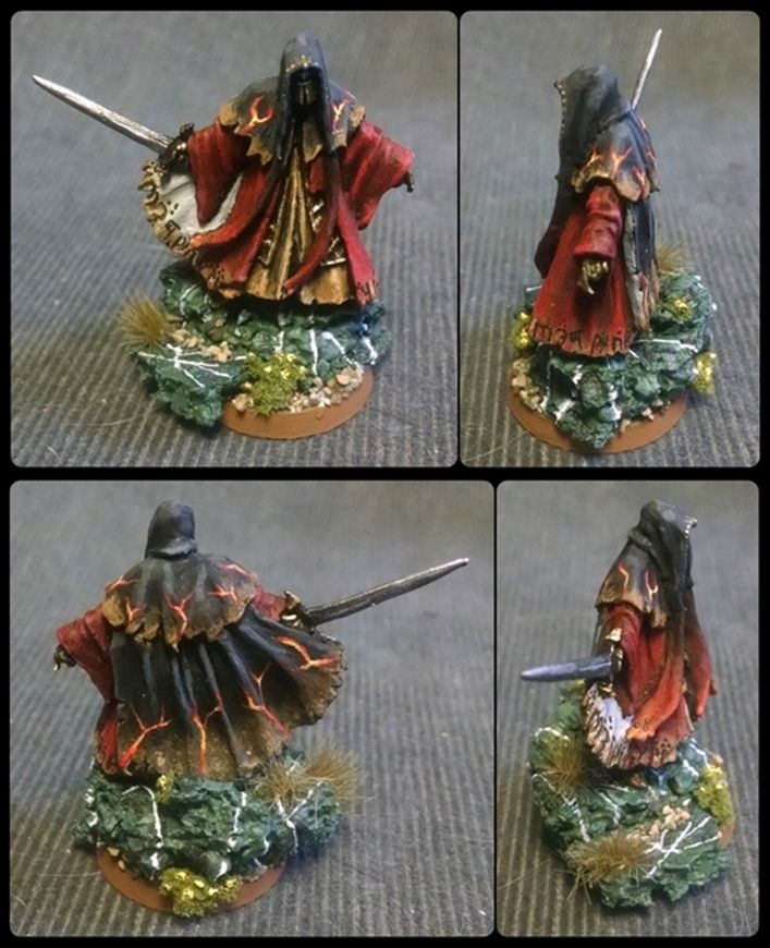
BillFerny333 - That is very cool cloak. The molten color is such a nice contrast. Like the golden yellow inner robes. great scheme overall for sure.
Karavatis - the base work alone is fantastic. I must say those models look very sharp. All the details and various colors you worked with here are stunning.
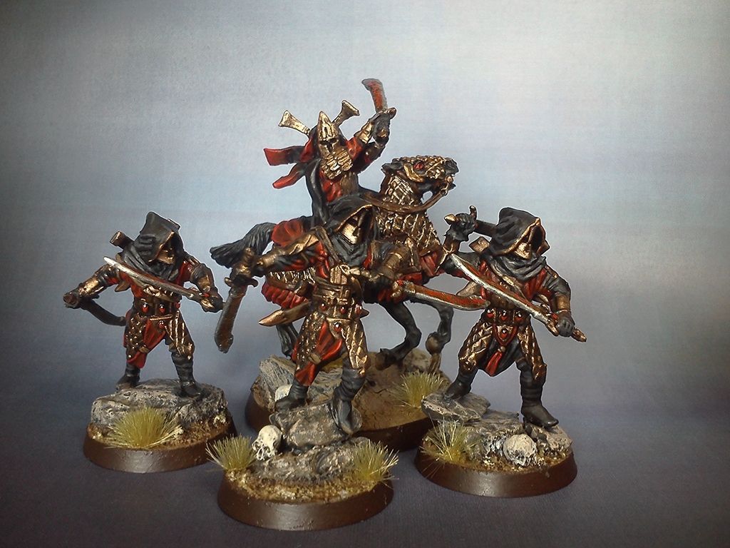
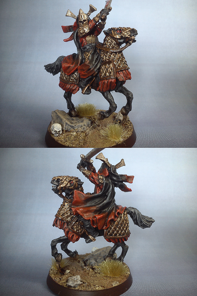
Haradrim - this looks like a fun project. You did a great work on the armor on the horses and the conversions themselves are well executed.
Bandobras Took - Love it. Great colors, well painted and a fantastic base.
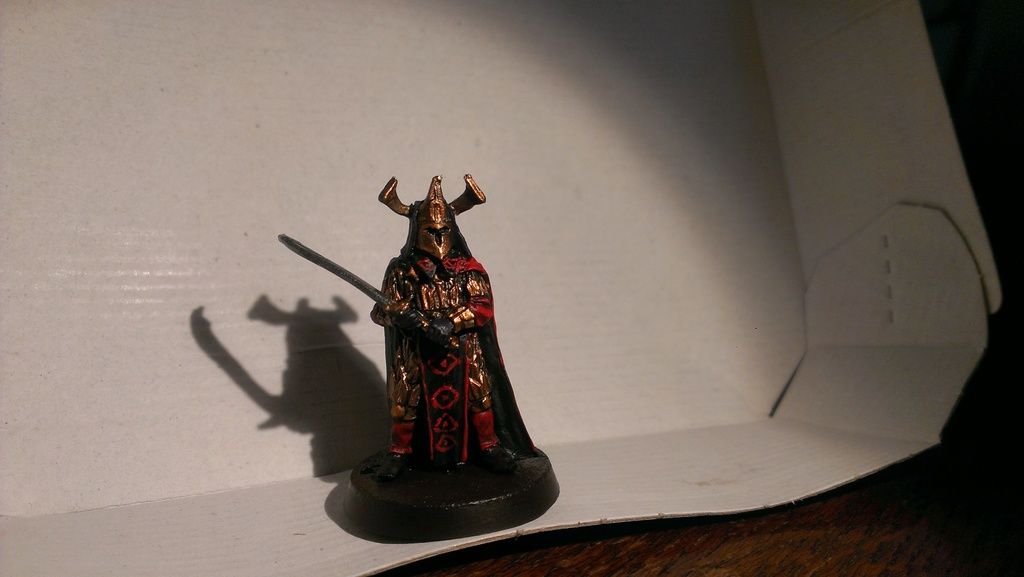
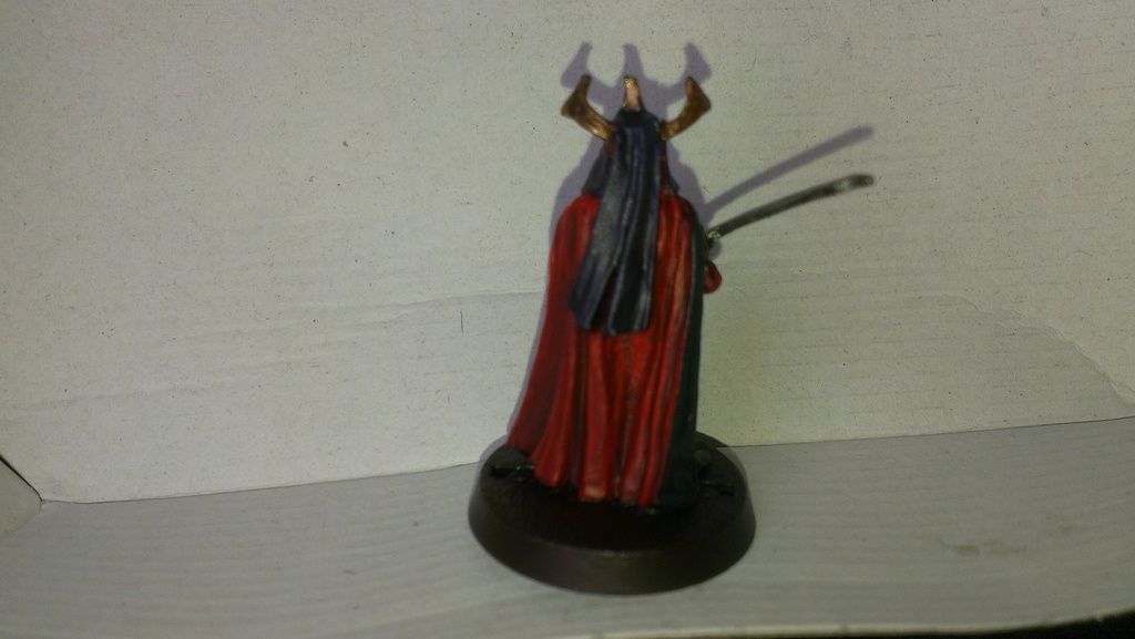
Baardeend - Solid concept and color scheme. I would like to see better photo's of the model as I think that the pattern is a great idea for this model.
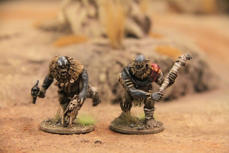
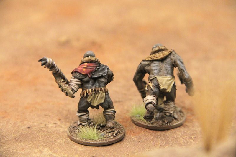
Eric - great work. You have achieved a very realistic tone and texture with this paint job. They look fantastic.
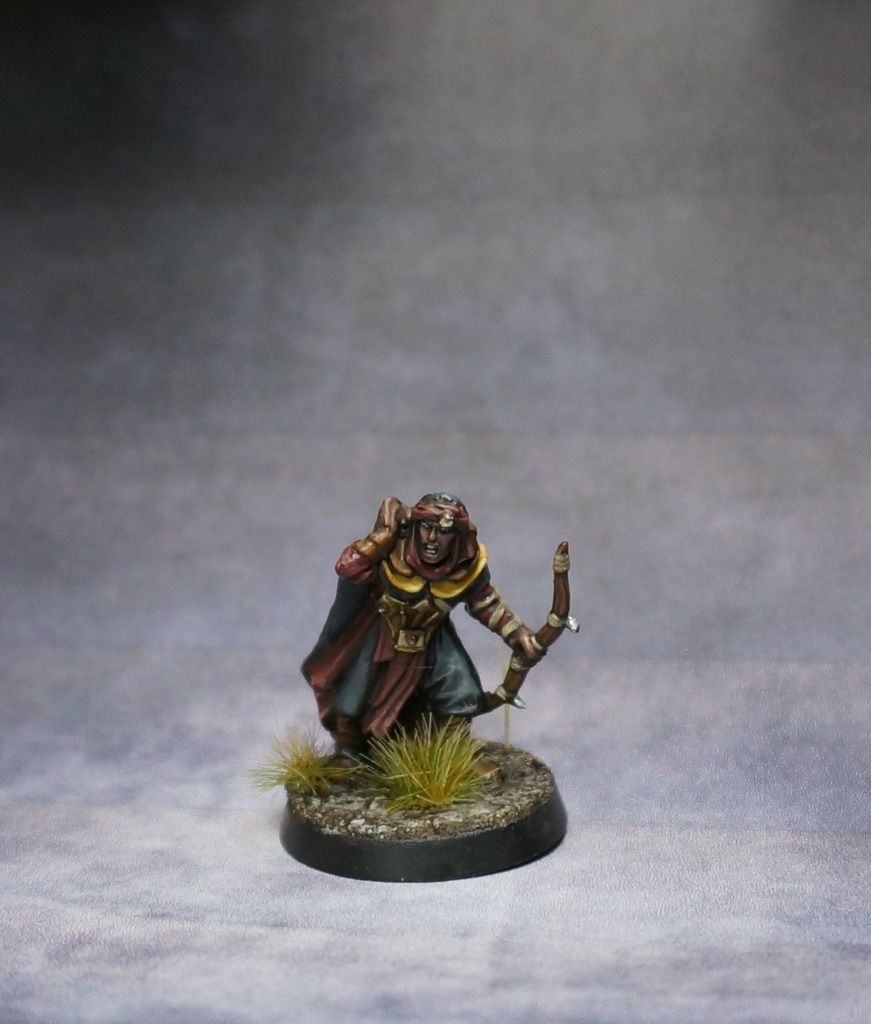
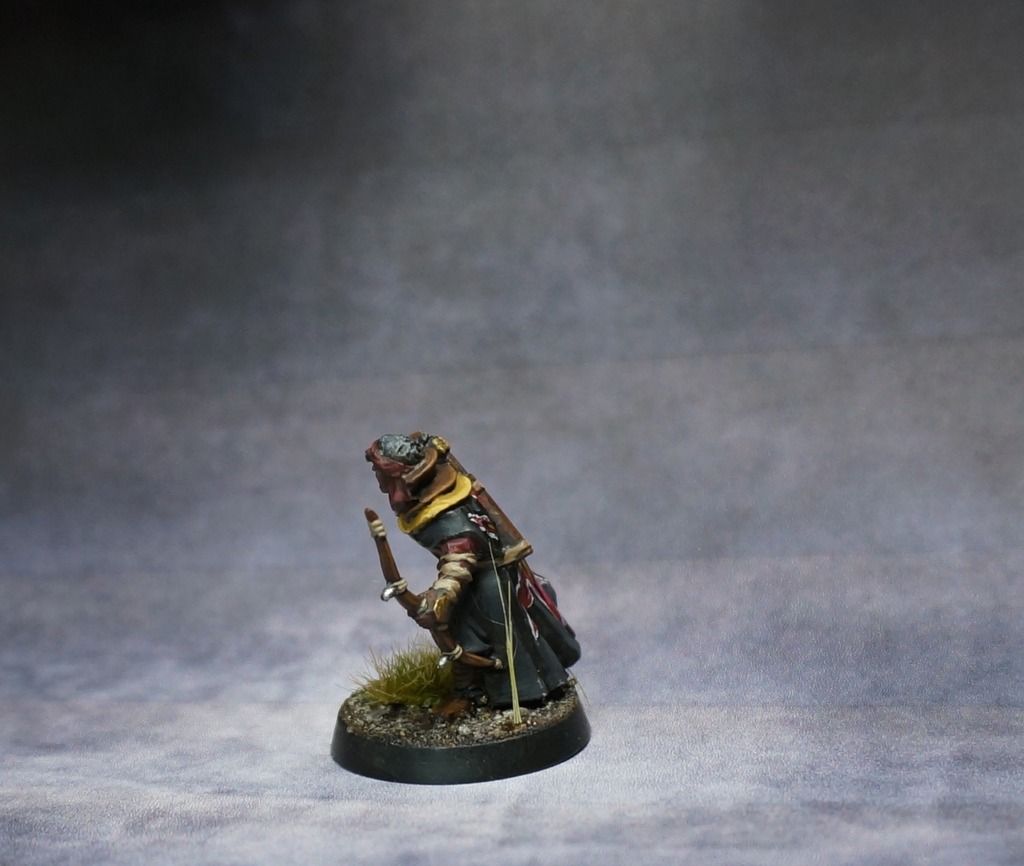
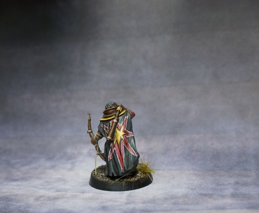
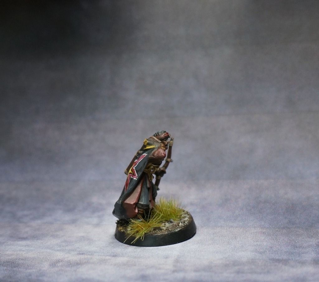
PowerOfWill - that is a very bold challenge you faced to pull that off. The overall scheme is great, the skin tone is perfect and the yellow as a spot color is working very well. Then you get to the cloak and you really did something that is tricky there. Good work. I hope you don't have to try to make that pattern on your whole army.

Dead Marsh Spectre - for a newbie you are coming along great.

Seriously though, the glowing effect is very original and very well executed, I hate to see what will happen if you actually give yourself time to really work on an entry some month, cause you last minute work is always well done. I am sure you are getting used to working under the clock anyway. I won't mention the bases, they are always well thought out and beyond me.
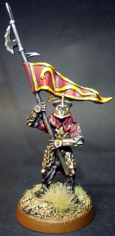
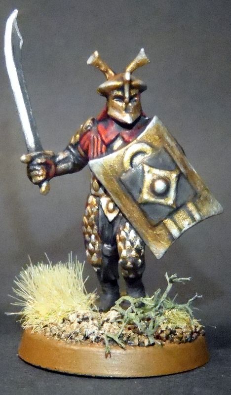
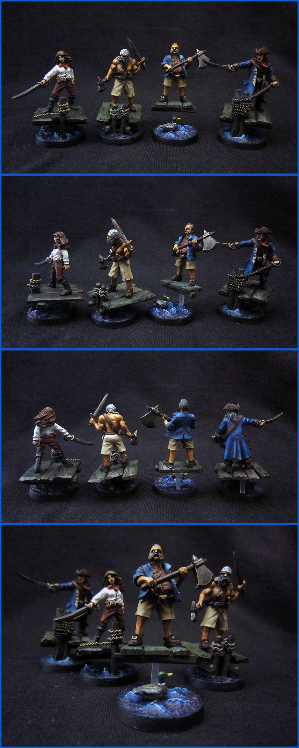
Valpas - that is crazy. I have never seen that scheme before. I would be interested to see how you would tackle a hero or banner in this scheme that can showcase it more on better sculpts.
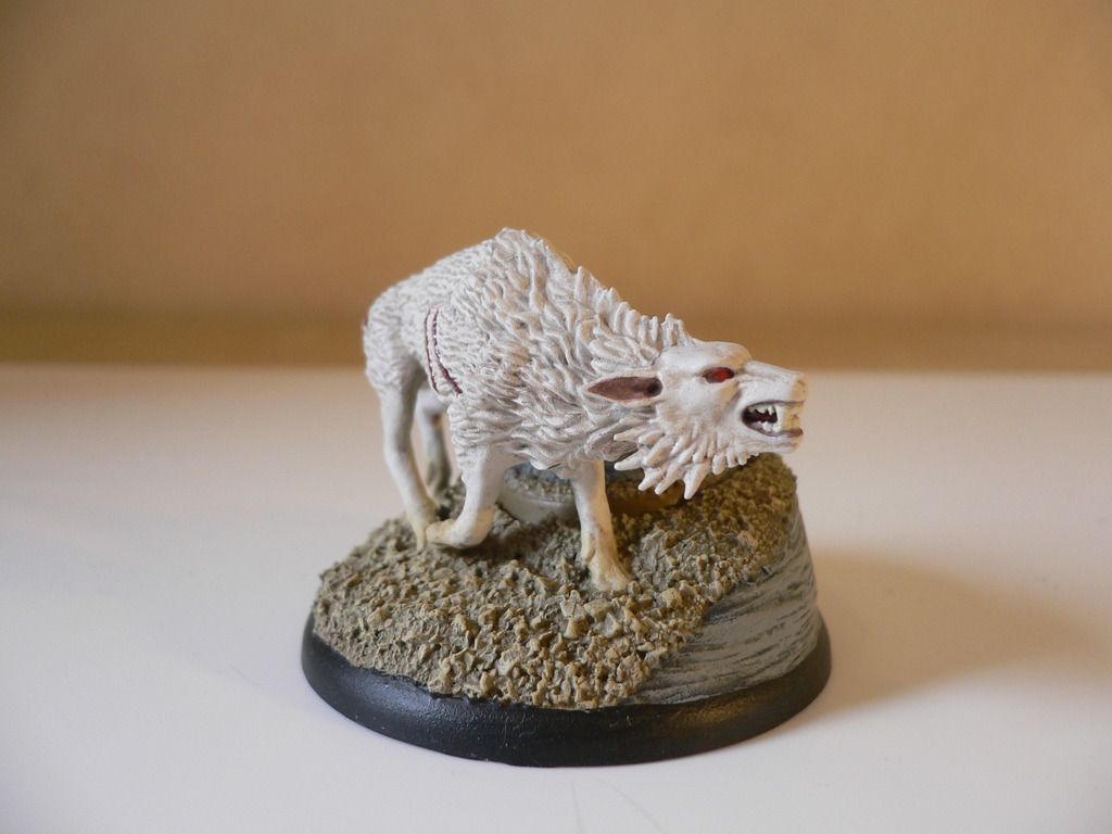
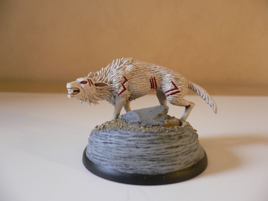
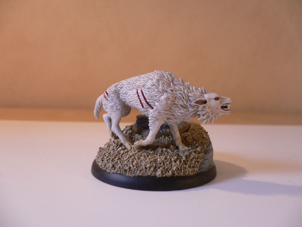
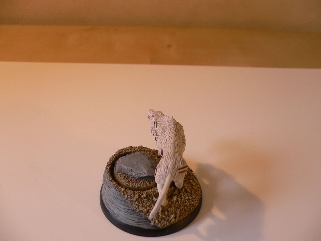
Orc-archer - That is a mean white warg you got there. Great paintjob.
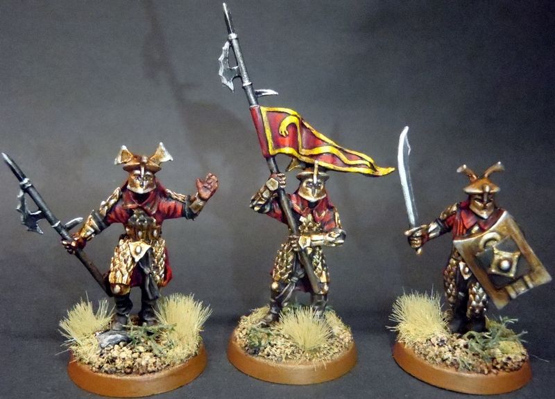
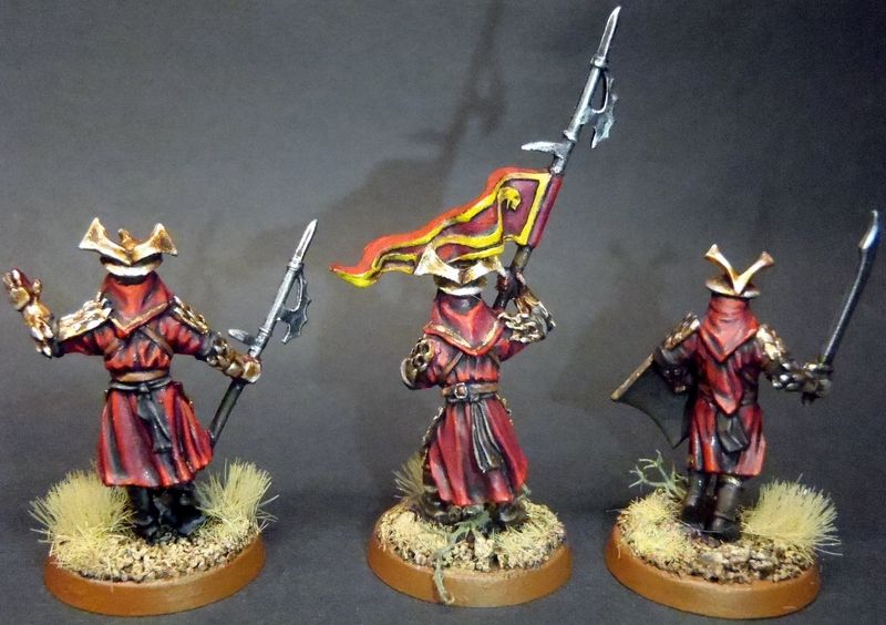
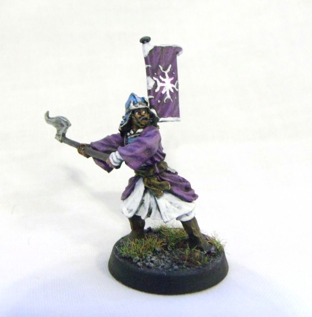
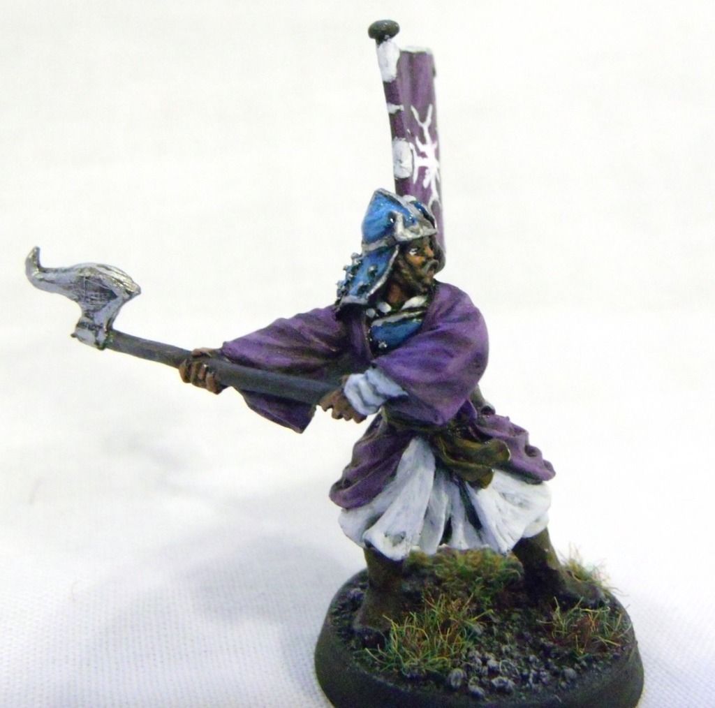
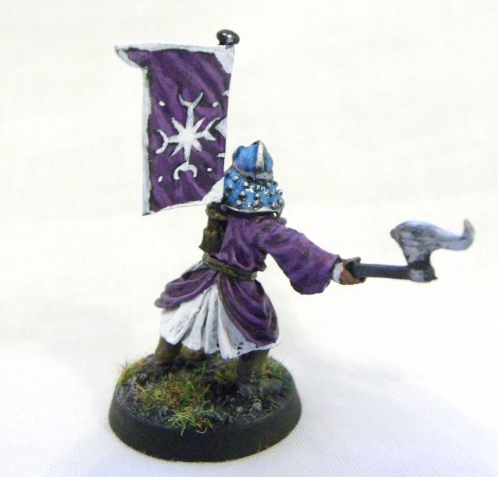
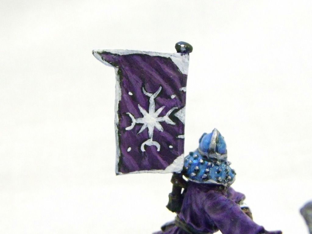
Wah Wing - Very original color choice. The banner is especially good.
 Top
Top Top
Top Top
Top Top
Top Top
Top Top
Top Top
Top Top
Top Top
Top Top
Top Top
Top Top
Top Top
Top Top
Top Top
Top Top
Top Top
Top Top
Top Top
Top Top
Top


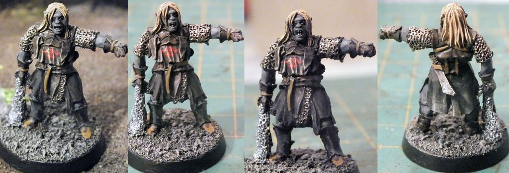
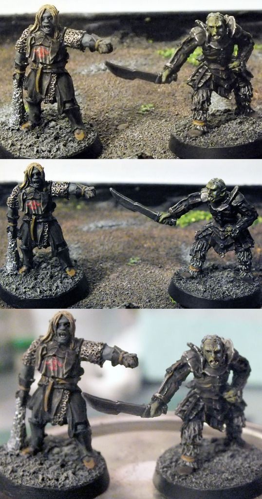
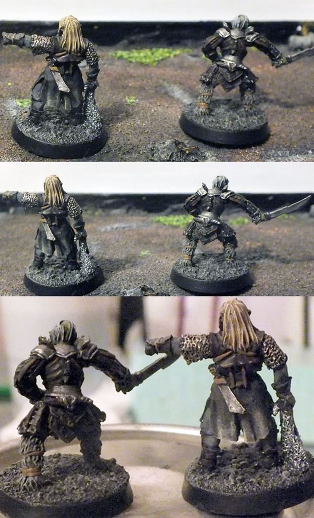
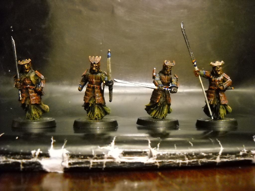
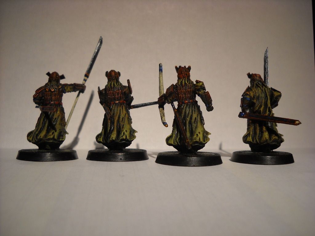


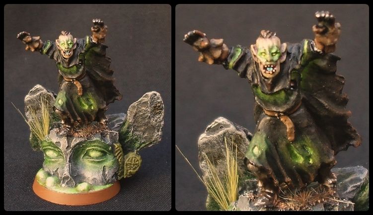
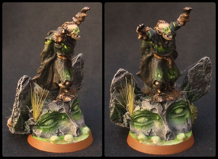
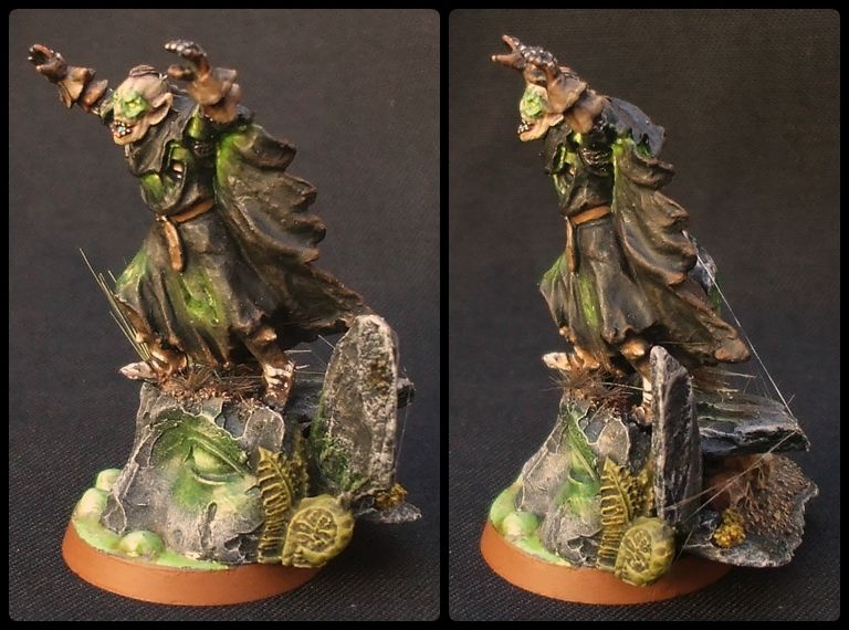
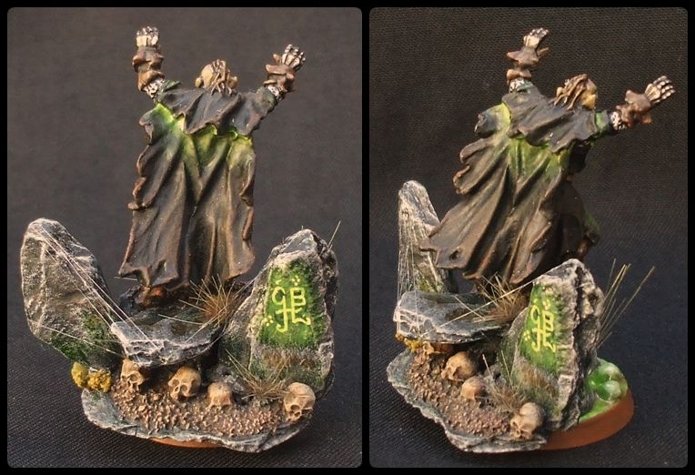






 Seriously though, the glowing effect is very original and very well executed, I hate to see what will happen if you actually give yourself time to really work on an entry some month, cause you last minute work is always well done. I am sure you are getting used to working under the clock anyway. I won't mention the bases, they are always well thought out and beyond me.
