The One Ring
http://wwww.one-ring.co.uk/

Sharky
http://wwww.one-ring.co.uk/viewtopic.php?f=50&t=28731
Page 1 of 2

Author:  Gandlaf the Grey [ Mon May 12, 2014 5:13 pm ]
Post subject:  Sharky

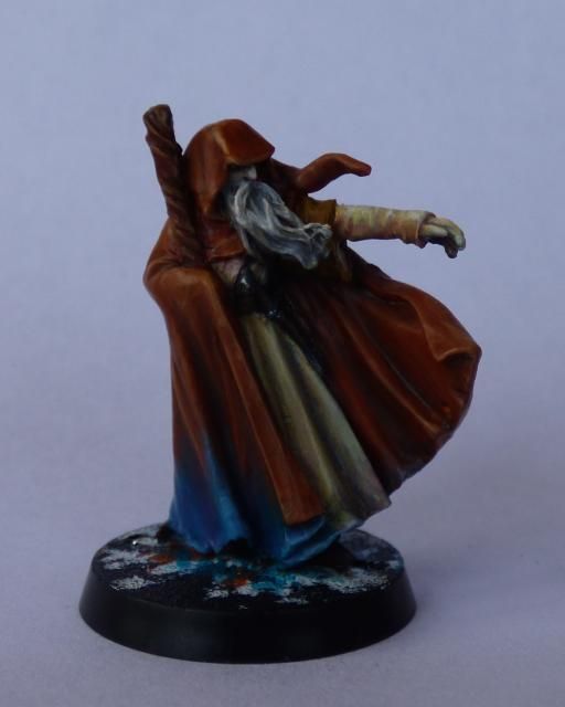
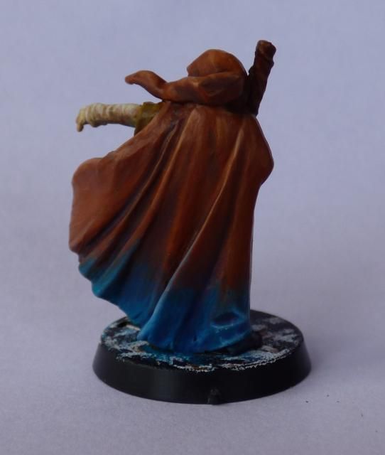
This is my latest effort and a break from my trolls while I await deliveries. This, I hope will be my entry for the May painting challenge. The photos are just taken quickly so don't look as good as reality but isn't that always the case ?

ImageImage
I am working on the base which I hope will make sense of the blue on the cloak, but I will leave that until I get it finished.

Author:  J.R. [ Mon May 12, 2014 5:16 pm ]
Post subject:  Re: Sharku

It is looking nice already ! But should your topic title not be SHARKY instead of the wargrider captain sharkU ?

Author:  Gandlaf the Grey [ Mon May 12, 2014 5:18 pm ]
Post subject:  Re: Sharky

Ooops, typo !!! Thanks

Author:  Harfoot [ Mon May 12, 2014 5:18 pm ]
Post subject:  Re: Sharku

I guess an ice and snow themed base? or an explosion in a blue paint mixer?

Author:  Dead Marsh Spectre [ Mon May 12, 2014 5:21 pm ]
Post subject:  Re: Sharky

I really like the blue!

Author:  Gandlaf the Grey [ Mon May 12, 2014 5:28 pm ]
Post subject:  Re: Sharky

Thanks all.
Kev - the blue is something I'm experimenting with. I'm finding GW paints are great for using as a base coat and adding VGC/VMC for the highlights and shading. There seems to be more opacity to the GW and keep there colour better even when thinned.
The blue started as GW Hawk Turquoise with VGC Ice Blue as highlights. Numerous glazes of VMS Regal Blue and GW Liche Purple for the shading and to work the blending.

Author:  mertaal [ Mon May 12, 2014 8:45 pm ]
Post subject:  Re: Sharky

Looking really super! I shall be painting mine this weekend I think, although quite a different look/feel. I hope he comes out half as good. Lovely smooth work, and interesting tones in the beige tunic.

Author:  Gandlaf the Grey [ Mon May 12, 2014 9:04 pm ]
Post subject:  Re: Sharky

mertaal wrote:
Looking really super! I shall be painting mine this weekend I think, although quite a different look/feel. I hope he comes out half as good. Lovely smooth work, and interesting tones in the beige tunic.

I always regarded his tunic as something I recall from the book that it was many colours, something you saw in FOTR as his descended the steps of Orthanc to meet Gandalf. So I decided I would set the tone with a beige and add various blues, purples and reds in light glazes.

Author:  Rognarr [ Tue May 13, 2014 9:37 am ]
Post subject:  Re: Sharky

Nice idea with the "many colours", something I really missed in the films! :)

Author:  Wise Old Elf [ Wed May 14, 2014 10:52 pm ]
Post subject:  Re: Sharky

This is fantastic, definitely one the better Sharkey's I have seen. Perhaps you could add a small white glow to the tip of the staff too, as a symbolic echo of Saruman's crystal. It would also create a nice visual equilibrium with the glowing blue at the base of the cloak.

Author:  BillFerny333 [ Sat May 17, 2014 9:36 pm ]
Post subject:  Re: Sharky

Excellent paint work!

Author:  Gandlaf the Grey [ Fri May 23, 2014 2:45 pm ]
Post subject:  Re: Sharky

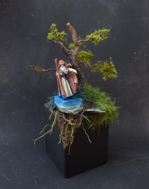
Finished.
The blue represents the evil of Saruman leaking out and killing everything. The side of the tree nearest him is dying while the furthest is still alive.Image
More photos are in the May painting challenge.

Author:  Goldman25 [ Fri May 23, 2014 4:09 pm ]
Post subject:  Re: Sharky

Whoa that looks awesome

Author:  Harfoot [ Fri May 23, 2014 6:27 pm ]
Post subject:  Re: Sharky

Very, very nice Mally, Orginal as well. How did you make the base?

Author:  mertaal [ Fri May 23, 2014 7:13 pm ]
Post subject:  Re: Sharky

Great work! The base really sets him off beautifully, and the blue is a really fun idea.

Author:  Gandlaf the Grey [ Sat May 24, 2014 12:16 pm ]
Post subject:  Re: Sharky

Thanks everyone
Harfoot wrote:
Very, very nice Mally, Orginal as well. How did you make the base?

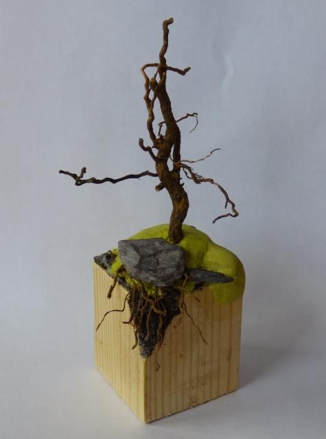
I started with a piece of 2x2 timber, cut a section and sanded down. I cut out the angled front section.
Now I applied Milliput and a root to form the tree with a couple of pieces of slate.
The tree needed a few extra branches gluing in place. You can see on the picture below that I trimmed a few branches off.
A few bits of root where used to create the roots...ironically !
Image
The ground now got a covering of dried compost, the stuff you buy from a garden centre. I find it fantastic for ground cover as it can be grinder fine between your fingers or left rough as it has all sorts of bits of wood etc in it.
When dried it all got several coats of mucky washes, browns, greens blacks to create the texture.
When dried I drybrushed some highlights.
Finally the grass was applied and trimmed a little. Some dark washes created depth to the grass and some highlighting finished it off.
The wood got a few coats of thinned black.

Author:  hannanibal [ Tue May 27, 2014 9:13 am ]
Post subject:  Re: Sharky

OK, this is probably my favourite miniature of yours to date. Your blending technique has come on leaps and bounds and the gradient from red to blue is masterful. I noticed the multitude of colours in the sleeve and inner robes too. Purples, pinks and reds with cream and white highlights and it looks excellent.

I am not too sure about the base though. I think it draws attention away from the detail of the miniature and the blue on the base, being a stronger, brighter colour than the main colours of the miniature, is a little too much. The blue on the grass also looks a bit off to me. Too strong and paint-like. I'm assuming the blue is a glow emanating from the robes of Sharky? If so I think the sides of the rock have been hit a little to heavily. I don't think the light would reach around the sharp corners of the top like that.
Sorry if that sounds harsh mate but I know you like your honest criticism and it really is only certain aspects of the base I can find fault with. The miniature itself is beautiful.

Author:  mertaal [ Tue May 27, 2014 10:28 am ]
Post subject:  Re: Sharky

Having painted him last night, he really is one of the underrated best sculpts in the game. The way his physique is suggested under the cloak is very well done, he has lots of movement and great composition. A new and unexpected favourite of mine. Glad I have two copies!

Author:  Gandlaf the Grey [ Tue May 27, 2014 3:54 pm ]
Post subject:  Re: Sharky

hannanibal wrote:
OK, this is probably my favourite miniature of yours to date. Your blending technique has come on leaps and bounds and the gradient from red to blue is masterful. I noticed the multitude of colours in the sleeve and inner robes too. Purples, pinks and reds with cream and white highlights and it looks excellent.

I am not too sure about the base though. I think it draws attention away from the detail of the miniature and the blue on the base, being a stronger, brighter colour than the main colours of the miniature, is a little too much. The blue on the grass also looks a bit off to me. Too strong and paint-like. I'm assuming the blue is a glow emanating from the robes of Sharky? If so I think the sides of the rock have been hit a little to heavily. I don't think the light would reach around the sharp corners of the top like that.
Sorry if that sounds harsh mate but I know you like your honest criticism and it really is only certain aspects of the base I can find fault with. The miniature itself is beautiful.

Thanks Han. Part of the reason for the steep colour transition was to test my blending skills and I am happy with how that side of things went.
The blue is representing his evil pouring out so it isn't OSL, more like water oozing out.
The idea has sort of worked but maybe my execution hasn't been quiet there.
Many thanks for your comments and I am pleased with the critique, how can you improve without it ?

Author:  hannanibal [ Tue May 27, 2014 4:40 pm ]
Post subject:  Re: Sharky

As far as the model goes I wouldn't do anything more to it. As it looks in the top picture I cannot see anything that needs improving. The blue gradient is perfectly executed and, if it's not a glow, looks like it's actually part of a "many coloured" cloth (and I wouldn't mind a step-by-step on how you did that haha).

The only thing I would change, and this is just personal opinion, is the base. The blue is overpowering and it does look like it's a badly behaved glow rather than a seeping evil.
The rest of the base would be brilliant for a diorama, it's very realistic but does detract attention from the brilliant miniature. Sharky is kind of lost in there. I'd want the focus to be on the mini rather than the surrounding area but once again, that's just personal preference.

Page 1 of 2 All times are UTC
Powered by phpBB © 2000, 2002, 2005, 2007 phpBB Group
http://www.phpbb.com/